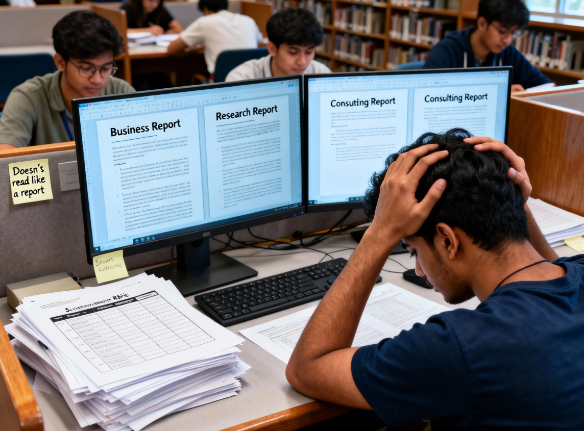
1. The most devastating moment for international students: In the same course, everyone's "reports" look like three different species.
You thought a report was just an article with a title, charts, and conclusions. But after submitting it, you got a comment that said:“"This doesn't read like a report."”
What's even more heartbreaking is:
- My groupmate A wrote something like an investment bank pitch deck—very "business-like" and very decisive.
- Student B's writing reads like a journal paper—very "academic," with an extremely long methodology section.
- Your writing reads like an essay—the logic is sound, but the teacher said...Inadequate reporting and lack of actionable details
So you start to wonder: Is it because my English is bad, or is there no standard way to write a report?
The answer is:There are indeed many types of reports.However, rubric only recognizes "what the type should look like".
II. Common Report Writing/Structure Mistakes (Key Areas for Deduction)
The following problems are not "poorly written", but rather...Let the graders directly determine that you wrote in the wrong style.。
1) Writing an Executive Summary as an Introduction: It looks more like a project proposal than a summary.
Common accidents:
- The summary should include background, motivation, and significance of the research, similar to an introduction.
- There is no concise information about "what you did, what you discovered, and what you recommended".
Correct executive summaryShould meet:
- Able to read independently (understand the conclusions and recommendations without reading the main text).
- Directly state: Objective → Methodology Overview → Key Findings (with data/direction) → Core Recommendations → Risks/Limitations (optional)
You can think of the summary as "a version for managers/mentors who are too busy to read the main text," not as "an opening statement."
2) The methodology and data sources are not clearly explained: the conclusions read like opinions rather than findings.
What teachers hate most isn't that your conclusion is wrong, but that your conclusion is wrong.Like expressing a position:
- “"We believe… / It seems… / It's obvious that…"”
- The source of the data, the nature of the sample, and the method of analysis were not specified.
At the very least, it needs to be explained clearly.:
- Data sources: Public data? Questionnaires? Interviews? Secondary literature? Internal company data?
- Time range: from which year to which year
- Analytical methods: comparison, regression, thematic analysis, cost-benefit analysis, SWOT analysis, sensitivity analysis, etc.
- Limitations: Sample bias, missing data, assumptions
The report's "conclusions" are not opinions, but rather "evidence-based findings."
3) Recommendations lack feasibility and priority: like a wish list.
Typical problems:
- We suggest writing it as a slogan: "Improve marketing strategy / Enhance customer experience"“
- There's no clear definition of who's in charge, when to do it, how much it will cost, or the order of priorities.
A more report-like suggestion should include:
- Executable Actions(do what)
- Priority(Which should be done first, and why?)
- Timeline(Short-term/Medium-term/Long-term)
- Person in charge/department(Who will do it?)
- Resources and Costs(Budget, manpower, tools)
- Measurement indicators(How to determine if it was successful)
4) Charts and graphs are disconnected from the main text, and explanations of indicators are missing: It looks professional, but it's actually deceiving yourself.
Many people think that "inserting a few charts" is like a report. Common problems with charts and graphs:
- Figures 1 and 2 were not cited in the main text.
- The abbreviations for the indicators on the chart are not explained (CAC, ARPU, NPS, etc.).
- The chart lacks units, time range, and source.
- The conclusion is presented forcefully, but the charts and graphs don't support it.
Proper chart writing:
- Chart Number + Title + Data Source + Unit/Time Range
- The main text must quote, for example, "See Figure 2," and explain "What does this figure illustrate?"“
- The chart is accompanied by a footnote explaining the meaning of the indicator (at least the first time it appears).
III. "Personal Safety Net Process" for International Students: Using multi-model comparison + rubric to select the optimal report version.
You don't need to get it right the first time. What you need is:Using processes to ensure final delivery。
Step 1: First, confirm the report type (don't start writing it right away).
Four common types (most common in schools):
- Business reportTargeting managers, emphasizing discovery and recommendations.
- Consulting reportIt's more like a solution provided to the client, with a structure that emphasizes "problem-analysis-solution-implementation".“
- Research reportIt is closer to academic research, with more emphasis on methods and limitations.
- Technical reportEmphasis on technical implementation, testing, performance, and specifications.
Key point: First look at the rubric and the target audience implied in the assignment instructions (manager / client / academic supervisor / engineer).
Step 2: Build a solid framework (first, get the "report-like" aspect right)
A universal and reliable framework (can be fine-tuned according to type):
Background → Methodology → Findings → Discussion → Recommendations → Risks → Appendix
- Background: What is the problem, and what is its scope?
- Methods: Where do data and analysis come from?
- Findings: What facts did you discover (preferably quantifiable)?
- Discussion: Explain the causes, impacts, and compare different solutions.
- Recommendations: Executable + Priority
- Risks: Uncertainty, assumptions, implementation risks and mitigation measures
- Appendix: Detailed tables, questionnaires, model parameters, and additional charts
Step 3: Generate 2-3 versions using different syntaxes, and select the optimal one based on the rubric.
Here are some areas where many international students can truly accelerate their learning:Don't just generate one version and then make hard modifications.。
It is recommended to generate three styles:
- More academicThe methodology is rigorous, the arguments are complete, and the citations/restrictions are clearer.
- More commercialThe summary is more concise, the suggestions are more practical, and the key points are highlighted.
- More conciseThe language is short, well-structured, and reads like a "deliverable".“
Then you compare it with rubric:
- Which version best fits the "scoring criteria"?
- Which version of the summary is the easiest to read independently?
- Which version of the recommendations is the most executable?
Step 4: Ensure consistency between the data and factual sources to avoid situations where "the wording changes but the facts change."“
Many people are most likely to make mistakes when comparing multiple versions:
- Version A says an increase of 121 TP3T, while Version B says an increase of 181 TP3T (because the model "casually came up with a more natural number").
- The chart data does not match the figures in the text.
Principle: The writing style can change, but the facts cannot.
What you need to do is:
- First, organize the "sources of fact" (data tables/citations/interview records).
- Specify which numbers are available
- Multiple versions of the writing all cite the same source of fact.
Step 5: Final "Readability Check" (A lifesaver 20 minutes before delivery)
The final hurdle wasn't grammar, but rather "whether it resembled a report that could be read quickly":
- Is the title informative (not just "Report", but "Feasibility Report for Entering Market X")?
- Are the charts numbered and self-explanatory?
- Summary: 150-200 words; can be read independently?
- Do the headings at each level match the content? (Don't write "Methodology" in the headings but then discuss the conclusions in the content.)
Four,DiffMind How to help you: Multi-model parallelism + difference comparison, directly select the optimal style.
If you frequently encounter the following problems:I don't know if what I wrote actually resembles a report.What you need is "contrast", not "refinement".
DiffMind's approach is:
1)Parallel output of multiple modelsFrom the same source of facts, different report styles are generated (more academic/more business/more concise).
2)Compare the differences in output:
- Does the structure fit rubric? (Are there any missing methods/limitations/risks?)
- Strength of the argument (whether it is data-driven, whether there is a causal chain)
- Match the tone to the audience (is it written to the manager or the supervisor?)
- Is the suggestion feasible (does it have priority, timeline, and cost)?
3) It helps you make "multiple choices": You're not endlessly revising, but rather...Choose the version that best fits the scoring logic from multiple available versions.。
(If you'd like, I can also specify "which versions to generate" according to your course rubric: for example, 60% is in analysis vs 40% is in recommendations, so prioritize the version with a stronger analytical structure.)
V. Self-Help Checklist (Check off each item before submission to avoid writing something that doesn't resemble a report)
You can copy this directly to the end of the document for self-checking:
Report type confirmation
- I'm clear on whether this falls under business, consulting, research, or technical categories.
- I know who my target audience is (manager / client / academic / engineer).
Summary (150–200 words suggested)
- Summary, not introduction
- The summary includes: objective, methodological overview, key findings (as data-driven as possible), and core recommendations.
- The summary is understandable on its own, without relying on the main text.
Findings (Every discovery must stand up to scrutiny)
- Every finding is supported by data/evidence (numbers, citations, samples, charts).
- I distinguished between "discoveries" and "opinions/guesses".“
- The data source and time range are clearly stated.
Recommendations (Executable + Prioritized)
- Each suggestion includes: action, priority, timeline, responsible person, cost/resources, and metrics.
- Suggestions that can be implemented, not just slogans.
Chart (self-explanatory)
- Chart number, title, unit, time range, and source are all complete.
- The text includes references to each chart and an explanation of its meaning.
- The first appearance of the indicator is explained (abbreviations are not omitted).
Appendix (Complete and Useful)
- Detailed data, additional charts, questionnaire/interview outlines, and calculation processes are included in the appendix.
- The main text can point to the appendix (e.g., "see Appendix A") when needed.
VI. The real problem you need to solve is not writing more like an "English essay," but writing like a "deliverable report."“
International students often struggle with anxiety about grammar, vocabulary, and sentence structure when writing reports, but teachers often deduct points for things that are more fundamental:
Have you selected the correct report type, ensured the structure is rubric, based your findings on evidence, and made your recommendations actionable?
When there are too many report writing methods and you can't choose the right one, the most effective method is not to force it in isolation, but rather:
Use a unified source of facts to generate multiple style versions from multiple models → compare with rubrics → select the optimal version → perform readability checks.